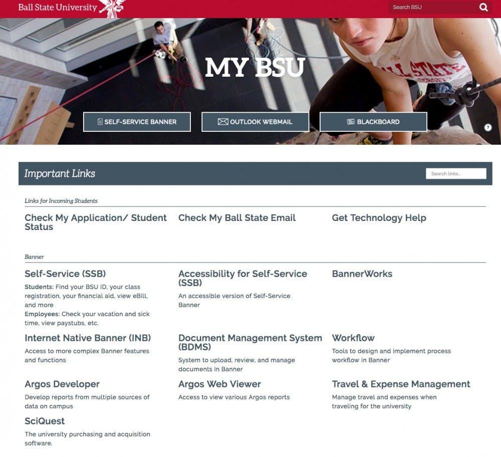
Visitors of Ball State's two main webpages will now see a new design.
MyBSU’s redesign was done by three Ball State students in the Digital Corps and Corps facilitator for training and design Riley Paulsen. Lindsey Geiser, a sophomore visual communication major, did all coding for the site and senior computer science major Chase Thiebaut worked on user experience and design. Rachel Regan, a Ball State alumna, also worked on the project before graduating in May.
Loren Malm, acting vice president for information technology, said that MyBSU is the portal to campus services for many students, faculty and staff.
"Since this site is used every day by so many people on campus, we were excited to roll out the MyBSU portal design,” Malm said. “The portal has been designed in a way that alerts and messages can be easily incorporated, and, over time, we expect the portal to become an important communication channel.”
MyBSU now requires students or faculty to sign into the page before seeing it. Three buttons form a banner at the top of the page for the three pages that the Corps felt students used most: Self-Service Banner, Outlook Webmail and Blackboard.
On a desktop computer, a user can press the number 1, 2 or 3 and then the enter button to take them to Banner, Outlook or Blackboard.
“The new MyBSU portal page was designed and created by Ball State students in the Digital Corps, who then worked with other IT professionals to take the new portal site live and incorporate features, such as a responsive design that works equally well with a desktop computer or a smartphone,” Malm said. “We appreciate the great work from our students in putting the new portal together, and we hope the entire campus community finds it easy to use and helpful.”
The redesign for bsu.edu, Ball State’s homepage, is “an ongoing process to improve how people get the information they need to work with the university,” Brandon Coppernoll, director of digital marketing and web, said.
“Our website serves many people: prospective and current students, alumni, faculty and staff, media and more. The most-accessed page on the website starts with the university homepage,” Coppernoll said. “The homepage features many updates, including a new look, mobile responsiveness and easy access to important information.”
The admissions section has also been redone to make it easier to find information and apply online, including step-by-step instructions for freshmen and transfer students.
“We will be rolling out more changes to the site in the future, which will continue to streamline how different audiences can reach the content they need as quickly and efficiently as possible,” Coppernoll said.


