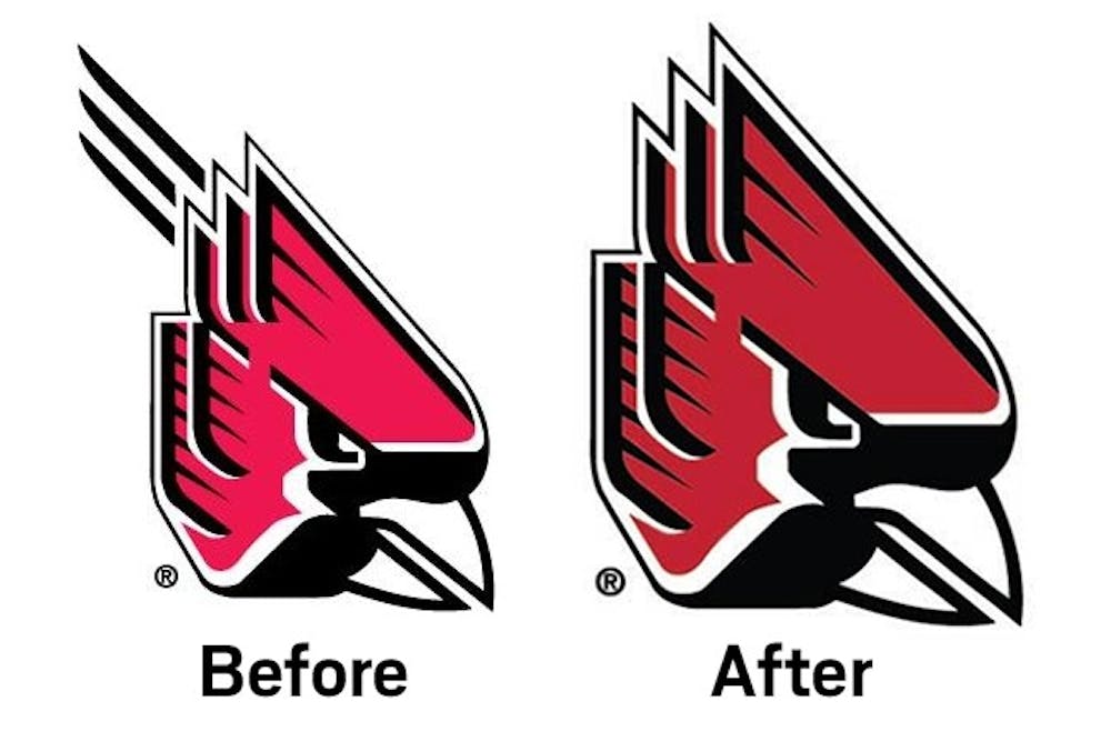
In an effort to refresh Ball State's brand, the university has made some minor changes to the Charlie Cardinal logo.
The changes includes the removal of the motion lines and deepening of the red.
"It sort of sends a subtle message that things are changing, things are improving," athletic director Mark Sandy said. "That refreshed brand can say things are on the move, and we're up to date and on the cutting edge of what people are looking for."
Sandy said the removal of the lines was not unanimous, but a majority supported it.
"It obviously helps with all the marketing. In this case, it makes the logo easier to sensor and it makes the Cardinal head itself larger without the lines," he said.
He said the change represents how the university is moving forward. The new football turf at Scheumann Stadium set everything in motion because it's featured on the turf.
"The university as a whole has been discussing how we could reframe our brand and make it look better without making whole scope changes," Sandy said.
Read More

'Proud and accomplished:' Delta girls' basketball ends historic season at semi-state
By Zach Carter / 1 hours agoDelta girls' basketball ended its historic season with a 74-44 loss to Norwell in the first game of semi-state.

6 Delaware County wrestlers advance in IHSAA Boys State Finals
By Logan Connor / 18 hours ago6 Delaware County wrestlers will finish with a medal at the IHSAA Boys State Finals after winning their first-round matches.

Sustaining plant life through harsh winter months
By Stephanie Weaver / 22 hours agoSparky’s Corner Greenhouse holds a variety of plants throughout the backyard of business owner Jeffrey Brubaker.